I recently got a part-time job at a beautiful bridal boutique a few miles away. I love the wedding industry and I really enjoy working with brides so it's a great fit. The owner has graciously allowed me to display some samples of my work and to give business cards out to brides and their families. After toying around with several different ideas, I settled on what I think shows what I have to offer and at the same time is eye-catching and pretty. (It always has to be pretty!)
In an 8x10 frame, I put a sample 5x5 envelope. The font is my take on "
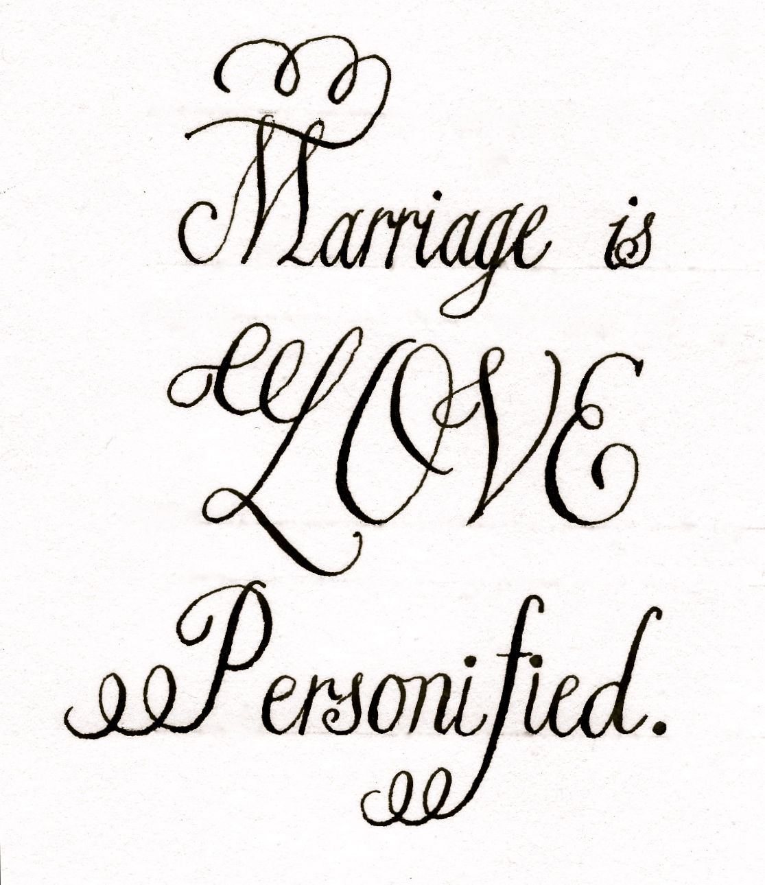
Citadel" and I really like it. It's a simple font that is easy to read but has enough flourish to make it special.
Please excuse the terrible photos.
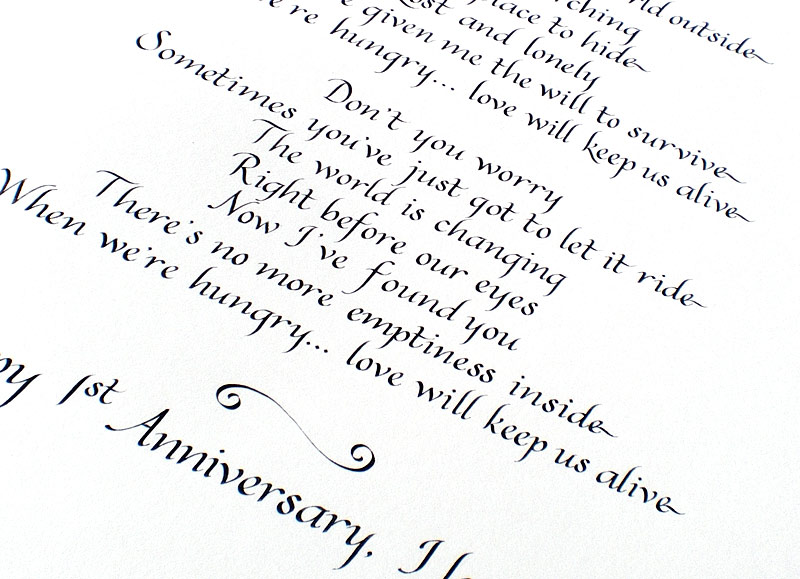
Below the envelope I put two samples of place cards. I did the "Belluccia" font for these. I really enjoy this font because it has so many options for flourishes and works especially well for something like a place card whereas it might get too busy if on an envelope.
Designing the frame was fun and after trying different options, I decided it would be striking and elegant to put a black strip of paper to divide the samples with my business name and blog address written in gray ink. The font is my own mix of styles which I call simply "Chic". The frame is substantial and fits in really well with the decor in the bridal boutique where this will proudly sit.
Unfortunately the pictures don't do it justice but I am really pleased with how it turned out! Remember if you know someone planning a wedding, let them know Calligraphy Chic can help them out with envelope addressing, place cards and so much more!
Happy Friday!